TL;DR: Trust in digital products comes from specific UX patterns like clear feedback, transparent data use, and predictable interactions, not from branding alone.
Users decide whether to trust a product within seconds of their first interaction, long before they read a privacy policy or a security badge. That decision shapes whether they complete a signup, enter payment details, or abandon the flow entirely.
We see many teams treat trust as a marketing problem, solved with testimonials and security logos. Trust is actually a design problem first. The interface itself either signals competence and transparency or it creates the hesitation that sends a user elsewhere.
Why Trust Is a UX Problem Before It Is a Marketing Problem
Every interaction either confirms or undermines a user’s confidence that the product will do what it says. A confusing error message, an unclear loading state, or a form that loses input on refresh chips away at that confidence. This happens even when the underlying product works perfectly.
Strong UX/UI design treats every screen as an opportunity to reduce ambiguity. Users trust systems they understand, and they distrust systems that behave unpredictably, regardless of how secure the backend actually is.
Feedback Patterns That Signal Reliability
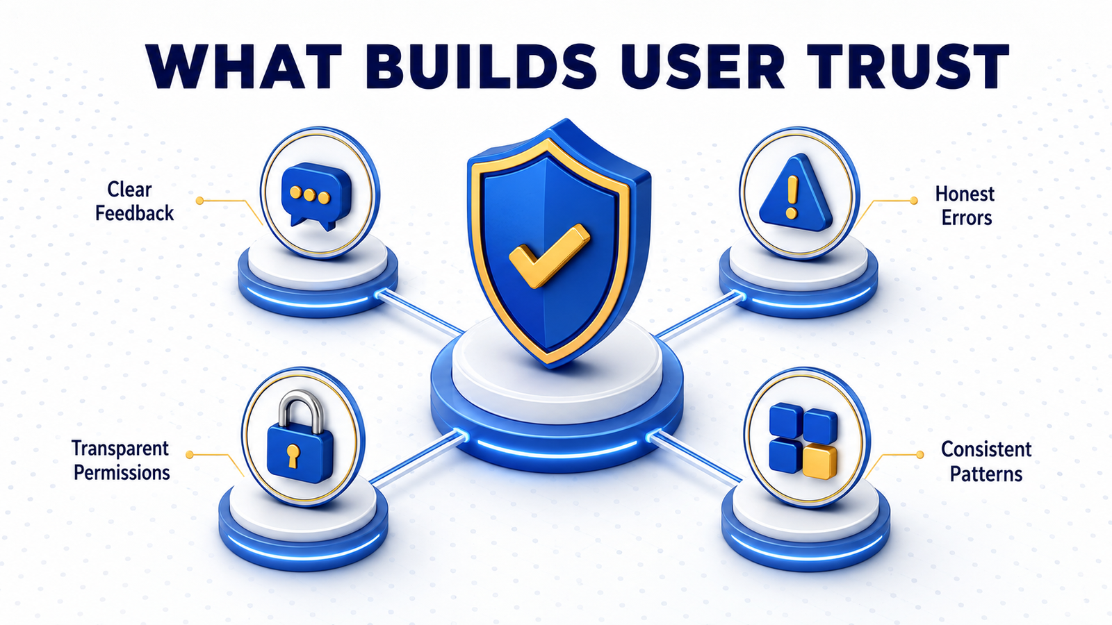
Immediate, specific feedback after every action reassures users that the system registered their input correctly. A generic spinner tells a user that something is happening; a progress indicator with a clear label tells them exactly what is happening and how long it will take.
Confirmation patterns matter most around irreversible actions. Deleting an account, submitting a payment, or sending a message to a large audience all deserve a clear confirmation step. That step should state the consequence in plain language rather than a generic “are you sure” prompt.
Error states deserve the same care as success states. A message that names the specific problem and the next step builds more trust than a generic failure screen. This holds even when the underlying error is the same.
Transparency Patterns Around Data and Permissions
Users increasingly notice when a product asks for more access than the task requires. A request for camera access before a user has even opened a feature that needs it creates suspicion rather than convenience.
The strongest products request permissions contextually, at the exact moment the user needs the feature. They explain in one short sentence why the access matters. This pattern alone measurably improves permission grant rates because users understand the trade they are making.
Data use transparency extends to billing and account changes too. Showing users exactly what a plan includes, when they will be charged, and how to cancel removes the hidden friction that erodes trust. This friction persists even in products with excellent cybersecurity practices underneath.
Consistency Patterns That Compound Trust Over Time
Trust builds cumulatively. A product that behaves the same way across every screen, uses the same terminology throughout, and keeps navigation predictable earns a deeper kind of trust. A single well-designed screen cannot deliver that on its own.
Design systems make this consistency achievable at scale. They enforce the same interaction patterns across a growing product rather than leaving each new feature to reinvent its own conventions.
Our design team builds UX/UI design services around these principles. We map every screen against the moments where users are most likely to hesitate. Talk to us about a UX trust audit for your product.
FAQ
How do you quickly identify trust gaps in a product?
Watch new users complete key flows like signup or checkout without guidance. Every point where they hesitate, re-read a screen, or ask a question is a likely trust gap worth redesigning.
Do trust signals like security badges still matter?
They still help, but they work best as a supplement to strong interaction design rather than a substitute for it. A trust badge cannot offset a confusing checkout flow.
How does onboarding affect long-term trust in a product?
Onboarding sets the user’s expectations for how the product will behave going forward, so a clear, honest onboarding flow builds a foundation of trust that later features can draw on.
Can small UX changes measurably improve conversion?
Yes. Changes like clearer error messages, contextual permission requests, and transparent billing screens frequently produce measurable improvements in signup and checkout completion rates.
Trust Is Built One Interaction at a Time
Users rarely articulate why a product feels trustworthy, but they notice immediately when it does not. The gap usually lives in small interaction details: an unclear error, a permission request with no context, a confirmation step that skips the consequence.
We help product teams find and close those gaps before they cost conversions.
Contact our team to start your UX trust audit.