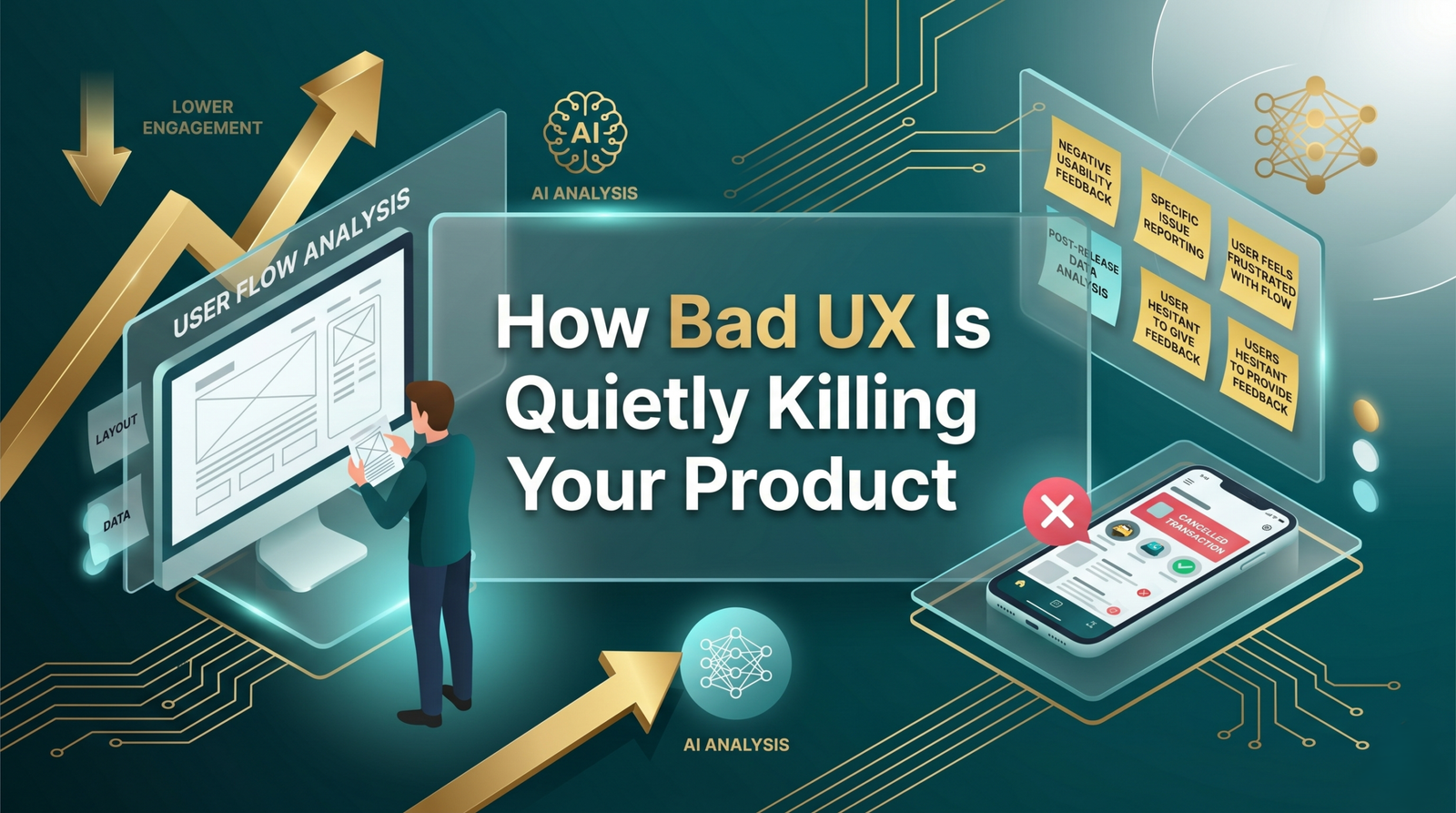
Most products do not fail because the underlying idea was wrong. They fail because people could not figure out how to use them, got frustrated trying, and left. Bad user experience rarely shows up as a single catastrophic moment. It accumulates slowly: a confusing onboarding flow here, a form that loses data on submission there, a navigation structure that made sense to the team but nobody else. By the time leadership notices the numbers, the damage is already done.
The Metrics That Hide the Problem
One reason bad UX goes unaddressed for so long is that it hides in metrics that look fine on the surface. Acquisition numbers can look healthy while retention is collapsing. Activation rates can look acceptable while the users who do activate never come back for a second session. Teams celebrate new sign-ups while the product is leaking users at every subsequent touchpoint.
The numbers that actually tell you if your UX is working are harder to track: task completion rates, drop-off points within specific flows, time-to-value for new users, and support ticket volume by feature. When customers keep asking the same question, that is a UX problem dressed up as a support problem.
Where Bad UX Hits Startups Hardest
For startups, the cost of bad UX is especially brutal because there is no existing brand loyalty to absorb it. A user who downloads your app and cannot figure it out within the first few minutes is gone. They will not give you a second chance. Early product traction depends almost entirely on that first-use experience, and most startups underinvest in it.
The common mistake is treating design as the last step rather than the first. Teams build the functionality, hand it to a designer to make it look presentable, and ship it. But UX decisions made during the build phase- things like how data is structured, how users move through the product, what happens when something goes wrong- are extremely expensive to undo later. Getting a UX/UI design team involved early is one of the better investments an early-stage product can make.
Where Bad UX Hits Enterprises Differently
Enterprise products have a different problem. The users often have no choice but to use the tool, which means bad UX does not necessarily drive churn. It drives something arguably worse: low adoption, workarounds, and people doing things manually that the software was supposed to automate. You pay for a system, and your teams find ways to avoid using it.
Internal tools are the worst offenders. Business intelligence dashboards nobody opens, HR platforms that require a 30-minute training video just to submit leave requests, and procurement tools so complex that purchasing managers keep a separate spreadsheet as their real source of truth. The software works technically. It just does not work for people.
Enterprises also tend to bolt on features over years without ever stepping back to reassess the overall experience. The result is a product that reflects the organisation’s internal politics more than it reflects how users actually work. A proper UX audit will usually surface these problems within a few sessions of user observation.
The Specific Things That Drive Users Away
Some UX failures are universal. Slow load times are the most documented: a one-second delay in page response time can reduce conversions by around 7%. Mobile layouts that were clearly designed on desktop. Error messages that say something failed without explaining what or how to fix it. Forms that do not save progress. Onboarding flows that ask for too much information before showing the user anything useful.
Then there are the subtler ones that are harder to catch without user testing: navigation labels that make sense internally but not to the person who has never seen the product before, calls to action that compete with each other on the same screen, and settings buried so deep that users give up and work around them.
Fixing It Without Rebuilding Everything
Good news: most UX problems do not require a full rebuild. They require a clear-eyed assessment of where users are struggling and a prioritised plan to address it. Heatmaps, session recordings, and basic user interviews tend to reveal the same issues repeatedly. Fix the highest-impact problems first and measure the result.
Innosaber approaches UX work as a continuous process, not a one-time project. Our design team works alongside engineering so that improvements ship regularly rather than waiting for a quarterly release. For products that need a more substantial overhaul, we also offer end-to-end custom software development where UX is designed into the product from the start.
The Business Case Is Simple
Improving UX is one of the highest-ROI investments a product team can make. Better onboarding reduces churn. Fewer friction points increase conversion. Clearer navigation reduces support load. Faster load times improve search rankings. These are not soft wins. They show up in revenue, retention, and operating costs.
If your product has the right functionality but the numbers are not moving the way they should, bad UX is probably worth investigating before assuming the problem is marketing or pricing. The product experience is often the thing nobody wants to look at because it is harder to fix than running another campaign. But it is usually the thing that matters most.
Our UX/UI team at Innosaber has worked with startups and enterprise clients across multiple industries. If you want a candid look at where your product experience is costing you, start a conversation with us.
FAQ
How do I know if my product has a UX problem?
The clearest signals are high drop-off rates at specific points in a user flow, recurring support questions about how to do basic things, low feature adoption despite availability, and qualitative feedback from users that the product is confusing or hard to use. If you are hearing ‘I didn’t know that was there’ regularly, that is a navigation problem.
What is a UX audit and how long does it take?
A UX audit is a structured review of your product against usability principles, combined with user testing and data analysis to identify where users struggle. The depth determines the timeline. A focused audit of a single flow can be done in a week. A comprehensive product audit typically takes two to four weeks.
Can you fix UX without a full redesign?
Yes, in most cases. Many UX improvements are targeted changes: simplifying a checkout flow, improving error messaging, restructuring navigation, or removing steps from an onboarding process. A full redesign is occasionally the right call, but it is rarely the first option.
How does bad UX affect SEO?
Directly. Page speed, mobile usability, and time on site are all factors that search engines consider. A slow, poorly structured site with high bounce rates signals to search engines that users are not finding what they need, which affects rankings.
What is the difference between UX and UI design?
UX (user experience) is about how the product works: the flows, the logic, the information architecture, and how users move through the product. UI (user interface) is about how it looks: the visual design, typography, colour, and interactive elements. Both matter, and they work together, but the UX problems usually run deeper than the UI ones.
Your product deserves a proper look
Most UX problems are fixable once you can see them clearly. The issue is that teams are usually too close to their own product to spot them without outside input. What feels intuitive to the people who built something is often anything but to the people using it for the first time.
At Innosaber, our UX/UI design team has reviewed products across industries and the same patterns come up repeatedly. We know what to look for and we know how to prioritise what to fix first. If your product has a UX problem you have not been able to put your finger on, start a conversation with us and we will take a look.